- UID
- 666628
- 積分
- 0
- 金币
- 0
- 精華
- 0
- 威望
- 0
- 贡献
- 0
- 閲讀權限
- 220
- 註冊時間
- 2010-11-21
- 最後登錄
- 2026-5-6
- 在線時間
- 0 小時
热心网友
- 金币
- 0
- 閲讀權限
- 220
- 精華
- 0
- 威望
- 0
- 贡献
- 0
- 在線時間
- 0 小時
- 註冊時間
- 2010-11-21
|
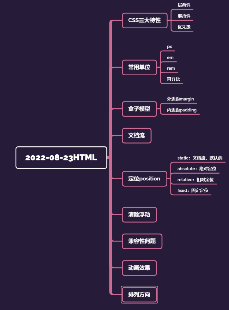
一、学习重点
二、学习内容
例题一
<!DOCTYPE html>
<html lang="en">
    <head>
        <meta charset="UTF-8">
        <meta http-equiv="X-UA-Compatible" content="IE=edge">
        <meta name="viewport" content="width=device-width, initial-scale=1.0">
        <title>Document</title>
        <style>
            div{
                width: 50px;
                height: 565px;
                overflow: hidden;
                /* float: left; */
                display: inline-block;
                transition: width 1s ease-in;
            }
            div:hover {
                overflow: visible;
                width: 1000px;
            }
        </style>
    </head>
    <body>
        <div>
            <img src="../img/libai.jpeg" alt="">
        </div>
        <div>
            <img src="img/libai.jpeg" alt="">
        </div>
        <div>
            <img src="img/libai.jpeg" alt="">

        </div>
        <div>
            <img src="img/libai.jpeg" alt="">

        </div>

    </body>
</html>
例题二
<!DOCTYPE html>
<html lang="en">
    <head>
        <meta charset="UTF-8">
        <meta http-equiv="X-UA-Compatible" content="IE=edge">
        <meta name="viewport" content="width=device-width, initial-scale=1.0">
        <title>Document</title>
        <style>
            .div1{
                width: 200px;
                height: 200px;
                background-color: skyblue;
                float: left;
            }
            .div2{
                width: 200px;
                height: 200px;
                background-color: orange;
                float: left;
            }
            .div3{
                width: 200px;
                height: 200px;
                background-color: grey;
            }
        </style>
    </head>
    <body>
        <div class="div1"></div>
        <div class="div2"></div>
        <div class="div3"></div>
    </body>
</html>
例题三
<!DOCTYPE html>
<html lang="en">
    <head>
        <meta charset="UTF-8" />
        <meta http-equiv="X-UA-Compatible" content="IE=edge" />
        <meta name="viewport" content="width=device-width, initial-scale=1.0" />
        <link
            rel="stylesheet"
            href="https://cdnjs.cloudflare.com/ajax/libs/animate.css/4.1.1/animate.min.css"
            />
        <title>Document</title>
    </head>
    <body>
        <h1 class="animate__animated animate__bounce animate__faster">An
            animated element</h1>
    </body>
</html>
三、笔记内容
CSS三大特性
1、层叠性
一个标签可以有多个CSS样式
浏览器处理冲突的能力,如果一个属性通过两个相同的选择器设置到元素上,样式的层叠规则
按照样式的声明顺序来层叠,就近原则
前提:选择器必须是同一种
样式不冲突,不会层叠
2、继承性
字标签会继承父标签的某些样式
比如文本颜色和字号。
3、优先级
权重:
(1)继承0---最低
(2)行内样式100
(3)权重相同,就近原则
(4)!important命令 无限大
| css权重公式 |
贡献值 |
| 继承、* |
0,0,0,0 |
| 标签选择器 |
0,0,0,1 |
| 类、伪类选择器 |
0,0,1,0 |
| ID选择器 |
0,1,0,0 |
| 行内样式 |
1,0,0,0 |
!important 无穷大
width,height 大于无穷大
max-width,max-height
min-width,min-height
| div ul li |
0,0,0,3 |
| li |
0,0,0,1 |
| a:link |
0,0,1,1 |
| div a |
0,0,0,2 |
权重不能被继承
贡献值是没有进位
!important。如果同时有max-width,max-height,!important不管用
<!DOCTYPE html>
<html lang="en">
    <head>
        <meta charset="UTF-8">
        <meta http-equiv="X-UA-Compatible" content="IE=edge">
        <meta name="viewport" content="width=device-width, initial-scale=1.0">
        <title>Document</title>
        <style>

            .fontStyle {
                color: yellow;
                font-size: 20px;
            }
            .a {
                color: red;
            }
            .backgroundStyle {
                background-color: green;
            }
            div {
                height: 200px;
                width: 200px;
            }
            p{
                height: 100px;
                width: 100px;
                background-color: blue!important;
            }
            /* div下的ul下的li */
            div ul li {
                color: red;
            }
            /* 这个页面上所有的li */
            li {
                color: yellow;
            }

            a:link {
                color: red;
            }
            div a {
                color: yellow;
            }
        </style>
    </head>
    <body>
        <div>
            <ul>
                <li>111111</li>
                <li>111111</li>
                <li>111111</li>
            </ul>
        </div>

        <h1 class="a fontStyle backgroundStyle">我是H1标签</h1>
        <div class="backgroundStyle">
            <p style="background-color: red;">我是div里的p</p>
        </div>

        <div>
            <a href="#">a标签</a>
        </div>

    </body>
</html>
常用的单位
px(像素):最常用
em:绝对单位,比如说父级的字号16px,
我可以设置成2em。
rem:由整个html的字号决定。当我们改变了浏览器的
字号设置,页面的字号也会发生变化
百分比:相对父元素的比例
<!DOCTYPE html>
<html lang="en">
    <head>
        <meta charset="UTF-8">
        <meta http-equiv="X-UA-Compatible" content="IE=edge">
        <meta name="viewport" content="width=device-width, initial-scale=1.0">
        <title>Document</title>
        <style>
            h1{
                font-size: 10em;
            }
            div {
                width: 80%;
                height: 300px;
                background-color: yellow;
            }
        </style>
    </head>
    <body>
        <h1>我是h1标签</h1>
        <div>123123</div>
    </body>
</html>
<!DOCTYPE html>
<html lang="en">
    <head>
        <meta charset="UTF-8">
        <meta http-equiv="X-UA-Compatible" content="IE=edge">
        <meta name="viewport" content="width=device-width, initial-scale=1.0">
        <title>Document</title>
        <style>
            p {
                /* 字体大小 */
                font-size: 20px;
                /* 字体样式 */
                font-style: italic;
                /* 字体粗细 */
                font-weight: bold;
                /* 字体修饰 */
                text-decoration:underline;
                /* 字体 */
                font-family: monospace;
                /* 复合属性 */
                /* font: 30px italic bold; */
            }

            div {
                /* 背景颜色 */
                /* background-color: rgba(25, 77, 135, 0.7); */
                width: 400px;
                height: 400px;
                /* 背景图片 */
                background-image: url(img/libai.jpeg);
                background-size: 400px;
                background-repeat:no-repeat;
                background-position: center;
                /* background:  no-repeat center; */
            }

        </style>
    </head>
    <body>
        <input type="color">
        <div>
            <p>我是div里的p</p>
        </div>
    </body>
</html>
<!DOCTYPE html>
<html lang="en">
    <head>
        <meta charset="UTF-8">
        <meta http-equiv="X-UA-Compatible" content="IE=edge">
        <meta name="viewport" content="width=device-width, initial-scale=1.0">
        <title>Document</title>
        <style>
            div ul li {
                list-style-type: decimal;
                list-style-position: outside;
                /* list-style-image: url(img/libai.jpeg); */
            }

            .div1 {
                width: 200px;
                height: 200px;
                background-color: yellow;
                border-radius: 50px;
                border-bottom-left-radius: 100px;
                border-style: solid;
                border-color: blue;
                /* border: 1px solid red; */
            }

        </style>
    </head>
    <body>
        <div>
            <ul>
                <li>111</li>
                <li>222</li>
                <li>333</li>
                <li>444</li>
                <li>555</li>
                <li>666</li>
            </ul>
        </div>

        <div class="div1">

        </div>

    </body>
</html>
<!DOCTYPE html>
<html lang="en">
    <head>
        <meta charset="UTF-8">
        <meta http-equiv="X-UA-Compatible" content="IE=edge">
        <meta name="viewport" content="width=device-width, initial-scale=1.0">
        <title>Document</title>
        <style>
            div {
                width: 200px;
                height: 200px;
                display: inline-block;
            }
            .div1,.div4{
                border-bottom-left-radius: 50%;
                border-top-right-radius: 50%;
            }
            .div2,.div3{
                border-bottom-right-radius: 50%;
                border-top-left-radius: 50%;
            }
            /* 区块属性:定义一个元素的显示方式 */
            .div1{
                background-color: green;
            }
            .div2 {
                background-color: blue;
            }
            .div3 {
                background-color: yellow;
            }
            .div4 {
                background-color: red;
            }

            .div5 {
                background-color: orange;
                /* 隐藏元素 */
                display: none;
            }

        </style>
    </head>
    <body>
        <div class="div1"></div>
        <div class="div2"></div><br>
        <div class="div3"></div>
        <div class="div4"></div>

        <hr>
        <div class="div5"></div>

    </body>
</html>
盒子模型
<!DOCTYPE html>
<html lang="en">
    <head>
        <meta charset="UTF-8">
        <meta http-equiv="X-UA-Compatible" content="IE=edge">
        <meta name="viewport" content="width=device-width, initial-scale=1.0">
        <title>Document</title>
        <style>
            div {
                width: 300px;
                height: 300px;
                background-color: orange;
                /* 外边距 */
                margin:100px;
                border: 10px solid red;
                padding: 20px;
                /* border-box:保证盒子的大小是300*300,外边距不包括 */
                /* box-sizing: border-box; */
                /* content-box:保证当前div的尺寸是300*300,不包含内边距和边框线 */
                box-sizing: content-box;
                /*
                    会算盒子的各个尺寸
                */
            }
        </style>
    </head>
    <body>
        <!-- 盒子模型 -->
        <div></div>
    </body>
</html>
<!DOCTYPE html>
<html lang="en">
    <head>
        <meta charset="UTF-8">
        <meta http-equiv="X-UA-Compatible" content="IE=edge">
        <meta name="viewport" content="width=device-width, initial-scale=1.0">
        <title>Document</title>
        <style>
            * {
                /* *号选择器初始化 */
                margin: 0;
                padding: 0;
            }
            div {
                width: 300px;
                height: 300px;
                background-color: orange;
                /* 外边距 */
                margin:100px;
                padding: 100px;
            }
        </style>
    </head>
    <body>
        <div>123456</div>
    </body>
</html>
文档流:
在网页中将窗体自上而下分成好多行
并在每行从左到右的顺序排列元素,即为文档流。
网页默认的布局方式。
定位position
1.static:文档流,默认的
2.absolute:绝对定位
相对于一个父元素的绝对定位。
当设置了绝对定位之后,原来的元素会脱离文档流。
在页面上浮起来。
3.relative:相对定位
相对于上一个元素的位置。
4.fixed:固定定位
子绝父相
子元素绝对定位
父元素相对定位
定位的left和top right和bottom
left是相对于父元素的位置
left是定位的属性
margin-left有啥区别?
相对于自己的初始位置
margin是盒子模型的属性
在开发中,尽量统一使用
<!DOCTYPE html>
<html lang="en">
    <head>
        <meta charset="UTF-8">
        <meta http-equiv="X-UA-Compatible" content="IE=edge">
        <meta name="viewport" content="width=device-width, initial-scale=1.0">
        <title>Document</title>
        <style>
            * {
                margin: 0;
                padding: 0;
            }
            .div1 {
                width: 300px;
                height: 300px;
                background-color: orange;
                position: absolute;
                left: 150px;
                top: 50px;
                /* margin-left: 150px; */
                /* display: none; */
            }
            .div2 {
                width: 200px;
                height: 200px;
                background-color: skyblue;
                /* 绝对定位 */
                position: absolute;
                /* 坐标 */
                left: 150px;
                top: 400px;
                /* visibility: hidden; */
            }
            .container {
                width: 600px;
                height: 800px;
                background-color: pink;
                position: relative;
                top: 100px;
                left: 200px;
            }
            .nav {
                width: 100%;
                height: 100px;
                background-color: red;
                /* 水平居中 */
                margin: auto;
                position: fixed;
                /* z轴的索引 */
                z-index: 1;
            }
        </style>
    </head>
    <body>
        <div class="nav">我是导航栏</div>
        <div class="container">
            <div class="div1"></div>
            <div class="div2"></div>
        </div>
    </body>
</html>
<!DOCTYPE html>
<html lang="en">
    <head>
        <meta charset="UTF-8">
        <meta http-equiv="X-UA-Compatible" content="IE=edge">
        <meta name="viewport" content="width=device-width, initial-scale=1.0">
        <title>Document</title>
        <style>
            div {
                width: 200px;
                height: 200px;
                background-color: skyblue;
                /* 可见性 */
                /* visibility: hidden; */
                /* 溢出策略 */
                overflow:scroll;
            }
        </style>
    </head>
    <body>
        <div>
            <img src="img/libai.jpeg" alt="">
        </div>
    </body>
</html>
清除浮动
<!DOCTYPE html>
<html lang="en">
    <head>
        <meta charset="UTF-8">
        <meta http-equiv="X-UA-Compatible" content="IE=edge">
        <meta name="viewport" content="width=device-width, initial-scale=1.0">
        <title>Document</title>
        <style>
            li {
                list-style: none;
                height: 30px;
                width: 100px;
                float: left;
                background-color: green;
                margin-left: 20px;
            }
            ul {
                background-color: pink;
                /* height: 50px; */
                /* 我想要的就是ul的尺寸是根据li的尺寸来自动确定 */
                /* 清除浮动,解决内容坍塌 */
            }
            /* 推荐使用的清除浮动 */
            .ulstyle:after{
                content: '';
                height: 0;
                line-height: 0;
                display: block;
                visibility: hidden;
                clear: both;
            }
        </style>
    </head>
    <body>
        <ul class="ulstyle">
            <li>1111</li>
            <li>2222</li>
            <!-- <div style="clear: both;"></div> -->
        </ul>
    </body>
</html>
双列布局
三列布局
css3兼容性问题
<!DOCTYPE html>
<html lang="en">
    <head>
        <meta charset="UTF-8">
        <meta http-equiv="X-UA-Compatible" content="IE=edge">
        <meta name="viewport" content="width=device-width, initial-scale=1.0">
        <title>Document</title>
        <style>
            div {
                /* 针对于火狐浏览器 */
                /* -moz-transition: ; */
                /* 针对于Safari和Google */
                /* -webkit-animation: ; */
                /* 针对Opera浏览器 */
                /* -o-animation: ; */

                /* Transition */
                width: 100px;
                height: 100px;
                background-color: orange;
                transition: width 2s ease-in 3s,height 3s,background-color ease-out 2s;
                /* transition-delay: 2s;
                transition-property: width;
                transition-timing-function: ease-in-out;
                transition-duration: 3s; */
            }
            div:hover {
                width: 500px;
                height: 500px;
                background-color:aqua;
            }
        </style>
    </head>
    <body>
        <!-- css3兼容性问题 -->
        <div></div>
    </body>
</html>
动画效果
<!DOCTYPE html>
<html lang="en">
    <head>
        <meta charset="UTF-8">
        <meta http-equiv="X-UA-Compatible" content="IE=edge">
        <meta name="viewport" content="width=device-width, initial-scale=1.0">
        <title>Document</title>
        <style>
            .div1 {
                /* 引用自定义动画,延迟时间 */
                animation: myAnim 5s;
            }
            /* 先声明动画,再使用 */
            @keyframes myAnim {
                0% {
                    width: 100px;
                    height: 100px;
                    background-color: orange;
                }
                25%{
                    width: 200px;
                    height: 200px;
                    background-color: blue;
                }
                50% {
                    width: 400px;
                    height: 400px;
                    background-color: red;transform: rotate(45deg);
                }
                75% {
                    width: 200px;
                    height: 200px;
                    background-color: blue;transform: rotateZ(180deg);
                }
                100% {
                    width: 100px;
                    height: 100px;
                    background-color: orange;transform: rotate3d(270deg);
                }
            }
        </style>
    </head>
    <body>
        <!-- animate -->
        <!-- transition和animate区别

            transition只能通过固定的属性来开始与结束值
        -->
        <div class="div1">123</div>
    </body>
</html>
排列方向
<!DOCTYPE html>
<html lang="en">
    <head>
        <meta charset="UTF-8">
        <meta http-equiv="X-UA-Compatible" content="IE=edge">
        <meta name="viewport" content="width=device-width, initial-scale=1.0">
        <title>Document</title>
        <style>
            .container {
                display: flex;
                /* 排列方向 */
                /* flex-direction: row; */
                /* 如果一条轴线上装不下,换行的方式 */
                /* flex-wrap:wrap-reverse; */
                /* flex-flow: row wrap; */
                /* 设置主轴的排列策略 */
                justify-content: space-evenly;
                /* 交叉轴 */
                align-items:flex-start;
                align-content: center;
                width: 900px;
                height: 900px;
                background-color: pink;
            }
            .flex1 {
                width: 200px;
                height: 200px;
                background-color: green;
                order: 1;
                /* 要将哪个项目放大,默认是0 */
                /* flex-grow: 2; */
                /* 要将哪个项目缩小,默认是0 */
                flex-shrink: 20;
                align-self: flex-end;
            }
            .flex2 {
                width: 200px;
                height: 200px;
                background-color: yellow;
                order: -2;
            }
        </style>
    </head>
    <body>
        <!-- flex布局
            块级元素和行内块级元素
            1.父容器要加上display:flex
        -->
        <div class="container">
            <div class="flex1">123</div>
            <div class="flex2">456</div>
            <div class="flex1">123</div>
            <div class="flex2">456</div>
            <div class="flex1">123</div>
            <div class="flex2">456</div>
        </div>
        <hr>
        <div class="container">
            <div class="flex1">123</div>
            <div class="flex2">456</div>
            <div class="flex1">123</div>
            <div class="flex2">456</div>
            <div class="flex1">123</div>
            <div class="flex2">456</div>
        </div>
    </body>
</html>
重点内容:
1、选择器*******************
2、css三大特征,层叠性,继承性,优先级
3、盒子模型,会算
4、定位
5、浮动,清除浮动****
6、常见的属性,字体,背景,列表,边框...
7、元素的隐藏,元素内容的溢出,overflow,display,visibility
开发中,推荐使用外部引入的方式。
来源:https://www.cnblogs.com/ljmskipper/p/16615942.html |
|


 發表於 2022-8-23 22:28:00